Friday, March 20, 2015

color schemes

Monochromatic 
Are derived from a single base hue and extended using its shades, tones and tints. Tints are achieved by adding white and shades and tones are achieved by adding a darker color, gray or black.
This room gives a very uniformed comfortable feel.
monochromatic


Analogous 
The analogous color scheme uses colors that are next to each other on the color wheel. One color is used as a dominant color while others are used to enrich the scheme. This color scheme gives a very lively feel. 
analogous      


Split-complementary 
The split-complementary color scheme is a variation of the complementary color scheme. In addition to the base color, it uses the two colors adjacent to its complement. This color scheme has the same strong visual contrast as the complementary color scheme, but has less tension. This room gives a romantic yet colorful feel. 
split

Triadic 
uses three colors equally spaced around the color wheel. This scheme is popular among artists because it offers strong visual contrast while retaining balance, and color richness.
triadic

Tuesday, March 10, 2015

Color Text Questions

1) What factors influence the psychological impact has on people?
  Age, gender , culture and life experiences are the things that influence the psychological impact on people.

2)Summarize the feelings each of the following colors evokes in people: red, green, and violet?
   Red evokes power,danger,strength,fire,and passions in people
   Green evokes the feeling of being refreshed, cool, friendly and peaceful.
   Violet evokes the feeling of being dignified and dramatic.

3) Name the secondary colors. What primary colors, in what proportions , are used to make each?
The secondary colors are orange green and violet. To make orange  you need and equal amount of red and yellow. To make green you need and equal amount of yellow and blue. To make violet you need and equal amount of blue and red.

4) Which color name is listed first in the name of a tertiary color?
The first name in the tertiary color always is the primary color used.

5) Contrast value and intensity of color?
Intensity of a color  refers to the brightness or dullness of a color.
Contrast is the difference in two colors,

6)What is the differences between tint, tone, and shade?
Tint is the any color with the addition of white.
Tone is the original color
shade is any color with the addition of black

7) Summarize how to neutralize a hue?
You can neutralize a hue by adding neutral color to the hue.

8)Name two warm colors and two cool colors.
Some colors include blue and violet and some warm color include yellow and orange.

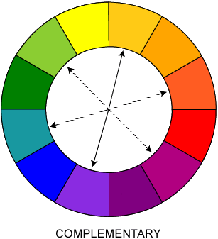
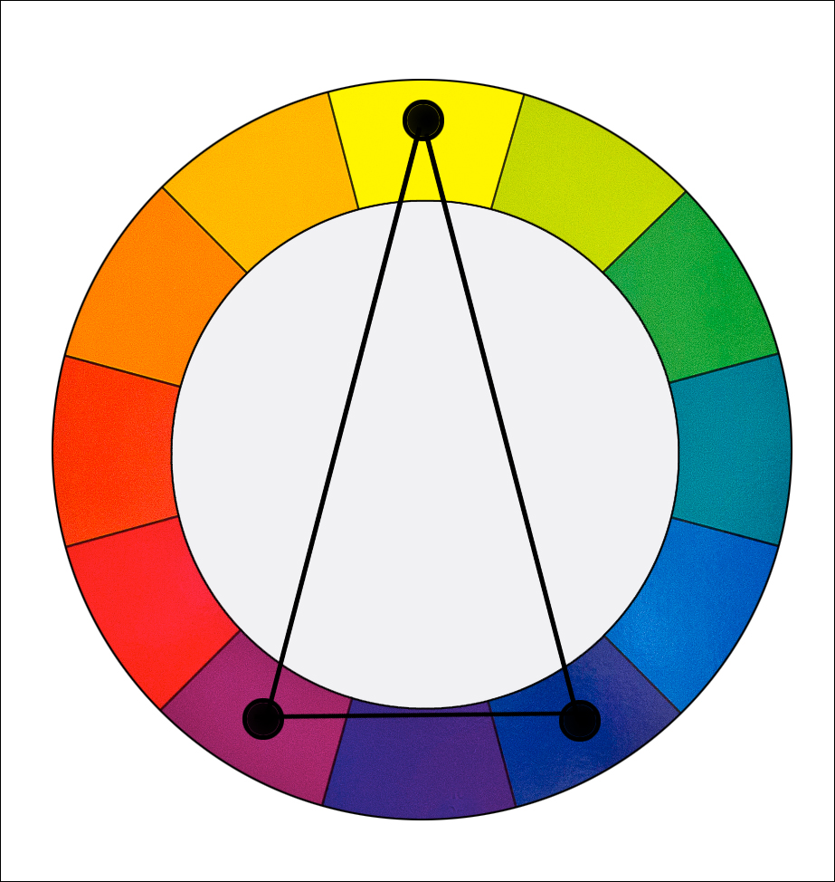
9) Identify an example of each of the seven color harmonies.
The seven color harmonies are, monochromatic, complementary, split-complementary, double-complementary, analogous, triadic, and neutral.

10) What factors influence the way color harmonies are used in planning an interior design.
When choosing colors for a room you wan to think about the moods and style the people want lifestyles of the clients function of the room and the items in the room and the location of the room .

11)Summarize the guidelines for using color correctly in a room design.
The guide lines for using color correctly are  using contrast if  you have a white couch on a black wall the white couch will draw more attention. When using color harmonies you want your base color to dominate.Select low intensity colors for large walls  if you use a high intensity color it can become overpowering. Heavy textures make colors appear darker.If a room is large use shades  to  make the room look smaller.In a small room use tint to make the room look bigger.

13) I would choose a soft yellow to make the room light and have a happy and warm feel to it. I think it would be bright even with the very little natural light because it is not a heavy cool color. Another choice would be white. White is fresh teacupful and  pure, it will make the room look crisper and livelier.

Sunday, March 8, 2015

texture


This week in Interior Design we learned about texture. There are three different categories of texture
one of the three is visual another is tactile and the last is audible. Visual texture is the appearance of a surface like the couch in my olioboard looks like it  has a soft texture or the yellow pillow look glossy and the side table looks shiny . Tactile is the feel of a surface like the chandelier in my olioboard has  a metal texture that is very smooth the blue table has a rough wood feel to it and lastly the magazine rack has a smooth metal feel to it . The last category of texture is audible that is the sound something makes when rubbed  if you went and rubbed the couch it would have a rough sound. If you rubbed the side table it would have a  squeaky sound and if you rubber the blue side table it would have a soft smooth to it. I think this room gives a very modern but comfortable feel because of all the different textures i have addedtexture

Monday, March 2, 2015

Element of Design - Line

This week in interior design we learned about different types of line. We learned how different types of lines give different effects in a space. You can make a space look bigger or smaller than it really is.


Horizontal
A horizontal line leads the eye side to side . Gives the effect of less height and more width.
Horizontal lines give a relaxed calming feel. Put these lines where you want to look wider.
As fancy as I get


Vertical 
A vertical line leads the eye up and down it adds height and slimness.If you want an area to look thinner add vertical lines.

Black, White and Blue Luxurious Living Room


Diagonal
A diagonal line is slanted.With a vertical line slant it gives slimness to a room. with a horizontal line slant it adds width. A diagonal line draws attention to the area used.This line is versatile and interesting.
Pattern Explosion

Curved 
A curved line makes spaces look larger than they really are. They increase the size and shape of the figure.It adds interest.
Dynamic Colour Pairing